Monday, October 23, 2006

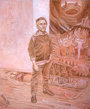
David Sandlin in His Studio (work in progress, 13)

Step 13

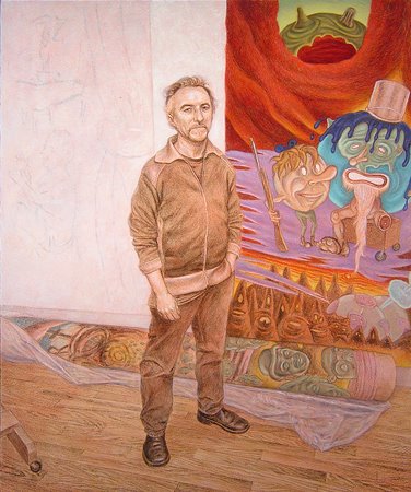
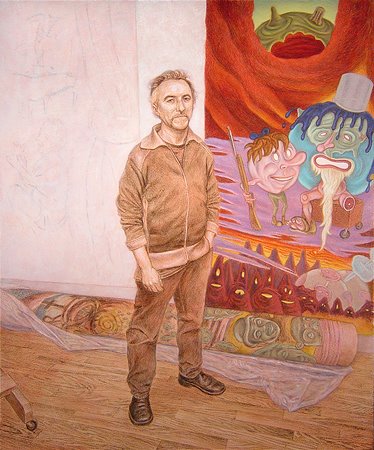
I'm working on a few more areas now, simultaneously. I continue to strengthen David's painting on the right side of the canvas, and have started to solidify the white wall behind his head as well as the depiction of his charcoal drawing to the left. My "whites" for those areas consist, at this point, of pale green tones (green earth + titanium white) over the pinkish underlayment. I'm also using delicate grays made from terra nera Romana and zinc white to begin to suggest smeared and partially erased charcoal passages. I applied a faint glaze of light yellow ochre and zinc white over the floor.
The challenge, I think, with my depiction of both David's drawing and especially his painting (besides making them look like his work) is to make them appear at once to be flat surfaces on a wall behind the artist yet have the vitality of the originals. I'm trying to keep their color intensity and modeling slightly in check so that the "3-dimensional" figure of the artist will emerge from the space by contrast.
Though the differences are subtle and probably not even apparent in these photos, a lot of painting has transpired since the previous post. It occurred across small areas and in multiple, overlapping layers of colors.

Sunday, October 15, 2006

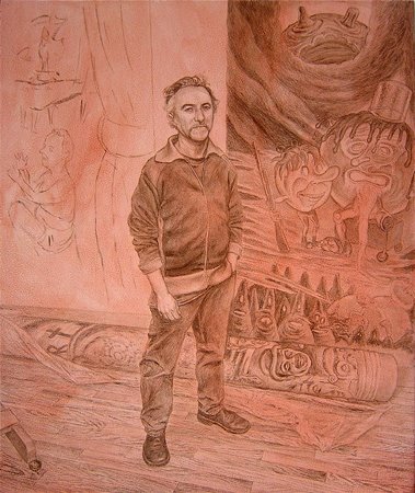
David Sandlin in His Studio (work in progress, 12)

Step 12

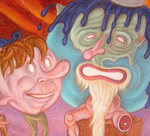
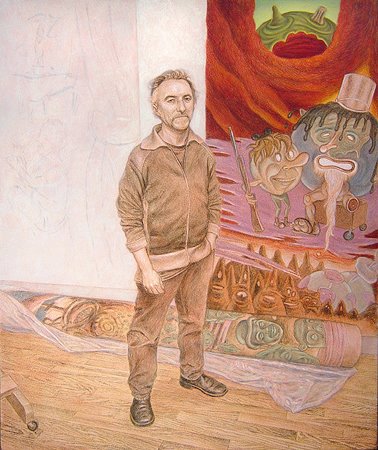
The painting of the painting behind David is gradually becoming more resolved (though scant time in the studio this week slowed down the process.) Below is a detail of the father and son globe figures. The Blogspot mechanism seems to degrade my image focus slightly, but the hatching technique is still apparent in this blow-up. I'll go to the kid's hair next and the block that the old bearded one is sitting on.


Monday, October 09, 2006

David Sandlin in His Studio (work in progress, 11)

Step 11

I'm continuing to work on the elements surrounding the figure. The practice is still the same as described earlier. I go over previous, thin washes of local color with more saturated glazes. I then modulate and augment those passages with a dry brush and more opaque colors. In general, I model each area of color with overlapping hatch marks of progressively lighter values; i.e., from dark to light.

Thursday, October 05, 2006

David Sandlin in His Studio (work in progress, 10)

Step 10

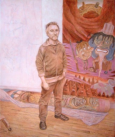
I'm going to keep the figure of David unworked for a while, as I begin to bring the other areas around him closer to a finished state. I'm glazing with more fully saturated colors, but mainly modulating the surface with a close pattern of translucent and opaque hatchmarks. What I want to do is surround David with approximations of the color values and resolution of forms that I think I want to end up with. I guess I'm trying to "set the stage" he inhabits before developing the central figure, rather than bring David into focus and then work the space around him. Also, I'm painting the elements in the pictorial space from back to front, distant objects first. I think that kind of actual, physical, overlapping of painted forms helps to create a sense of objects situated in a believable space, one in front of the other. Certainly, once I begin to render David's figure, I'll have to make adjustments to the other areas. There will be a lot of give and take among the elements as the painting progresses. Athough the area of the painting in the upper right corner where I've concentrated looks relatively complete, it is by no means so.

Monday, October 02, 2006

David Sandlin in His Studio (work in progress, 9)

Step 9

I have begun to apply transparent washes of local colors over my monochromatic underpainting. Basically, I want to establish the general color array of the composition. I'm mixing very dilute glazes of inherently transparent pigments -- yellow ochre, terre verte, prussan blue, red earth, etc. If I need to add white pigment to the mix, I'll use zinc white, which is much less opaque that titanium. I want to ensure that the details of the underpainting are not obscured at this early point.

Sunday, October 01, 2006

David Sandlin in His Studio (work in progress, 8)

Step 7 (or 8...)

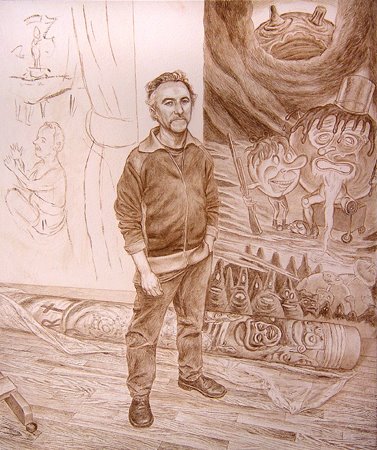
I've gone about as far as I want to with the underpainting. A little more umber, white, black, and Venetian red casein. I could probably take it a bit farther, but, as is usually the case, I stopped when I became impatient to work in color. So, the next step is to brush over the entire surface with a dilute egg yolk wash (around 8-10 parts water: 1 part yolk) to seal the surface somewhat. The casein surface is fairly "thirsty." If I prime the underpainting with a little egg, the tempera goes on easier in the early passes.

Saturday, September 30, 2006

David Sandlin in His Studio (work in progress, 7)

Front surface

Back of panel

While I normally prepare my own boards with home-made rabbit-skin glue gesso, this time I'm painting on a vintage, commercially prepared gesso panel. I recently bought a number of panels, probably manufactured in the 1940s-50s, from the estate of Athens, GA, artist Frank Ruzicka. The panels have a rough, spattered texture instead of the usual smooth finish. The gesso was obviously sprayed on. It's a nice surface to work on. I've seen temperas by Reginald Marsh from the '40s on boards with a similar surface. This is a 24 x 30 panel that I cut down to size.

David Sandlin in His Studio (work in progress, 6)

Step 6

I have just started working across the image with white casein. Some passages are scumbled, or kind of broadly washed, most are built up with small hatch marks. With casein, I've found that if I dilute the white too thinly in washes, it may look wonderfully subtle and perfect, but when I come back over it with the first washes of egg tempera colors, the palest white washes have a tendency to disappear. I'll continue refining the forms and details with white a bit longer before I return to the darker values.

Friday, September 29, 2006

David Sandlin in His Studio (work in progress, 5)

Step 5

I have now brushed over the whole panel with a couple of thin veils of Venetian red casein washes. I'm not worried about the uneven application of color. There's a lot more that needs to occur to the underpainting. This step provides a nice middle-ground value and injects a warm glow that will affect all the subsequent colors to follow on top of it. I'll work into the image next with white casein to bring back lighter values, and also punch up the darker values with black. The casein I'm using on this painting is Shiva brand tube colors. I sometimes mix dry pigments into straight casein emulsion, but the tubes are pretty convenient.

Thursday, September 28, 2006

David Sandlin in His Studio (work in progress, 3 &4)

Step 3

I've started working over the transfered chalk lines with dilute burnt umber casein paint and a fine brush. Casein is a relative of egg tempera, but instead of using egg yolk as a binder for the pigment it uses a milk-based glue. You can still see some of the red chalk indications and I have begun to model the figure's forms with washes of casein and hatchwork.

Step 4

Here's the more complete state of the initial underpainting. I try to develop a lot of the detail and values that will guide the color work to follow.

David Sandlin in His Studio (work in progress, 2)

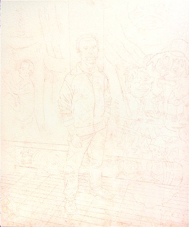
Step 2

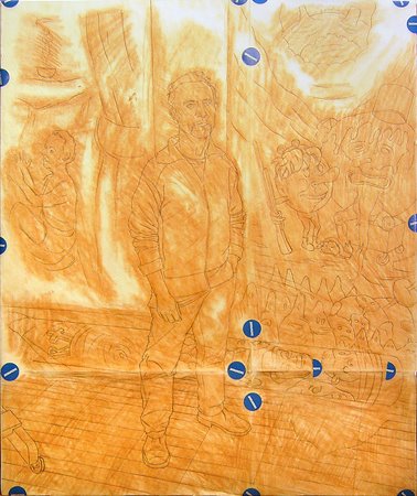
This faint image shows the results of transfering the composition from the original drawing to the gessoed panel. I made a tracing of the drawing onto "vellum," a.k.a. tracing paper. Across the back of the vellum I rubbed a coating of red-earth chalk. Actually, the chalk is a chunk of naturally pigmented, dry clay purchased from an art supply store in Florence, Zecchi, and really well suited for this purpose. I fix the tracing to the panel, chalk side down, and draw over the lines again to impress them onto the surface of the gesso. It's like using a carbon paper to make a copy. What's the point of going to all this trouble, you might ask? Why not just draw an image directly onto the gesso? Well, rabbit-skin glue gesso is very absorbant and fairly soft. I mess up a lot when I'm trying to find the forms in a composition. This way I can work out a lot of the initial problems on paper and erase or redraw as often as need be without mussing up the gesso surface. When I finally get the drawing right, or close to it, it's a simple matter to dupe it to the panel. The next step is to reinforce the transferred image. Some people use dilute India ink, or egg tempera. Lately, I've preferred to use casein paint.

Below is a photo of my pieced-together vellum. The blue dots are just some adhesive drafting tabs I had on hand that I used as tape.


Wednesday, September 27, 2006

David Sandlin in His Studio (work in progress, 1)

Step 1

Here's the drawing I'll start with, on paper the same size as my panel, 24 x 20 inches. Basically just the contours of all the elements in the picture. I'll work more on David's likeness on the panel itself.