Wednesday, November 22, 2006
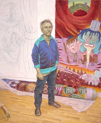
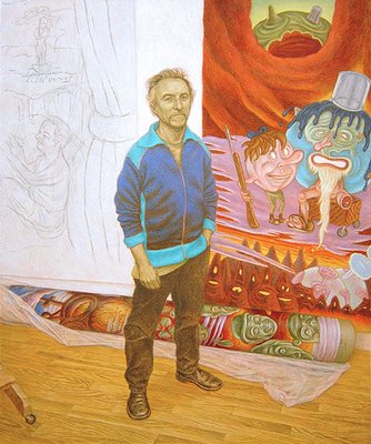
David Sandlin in His Studio (work in progress, 19)
A couple of details of the mostly finished painting. For a sense of scale, his head is about 3 inches tall (8 cm) in the painting. I'll let it sit for a few days or weeks as I work on the next painting. A few aspects of it bother me right now, but I'll stare at it for some time and see if they diminish or increase in my judgment. For instance, the photograph exaggerates an awkward spot on his mouth. It doesn't look quite so wrong in real life, but I'll probably go back in a couple of days and mess with it. The same goes for his proper left eye. It looks a bit dead as I study this photo of it.
Tuesday, November 21, 2006
David Sandlin in His Studio (work in progress, 18)
Step 18
A lot of work has transpired, most obviously in the flesh tones, shoes, floor, easel, plastic wrap. I don't have sequential images to illustrate the painting of his face and arms, unfortunately. The process proceeded too quickly and I didn't want to break my step to pause and set up for photography. However, here, in words, is roughly how it went: Over the green-earth base coat I began by applying a dark, warm tone in the places where lighter values turn toward shadow. That first flesh tone was composed of a fairly transparent Venetian red tinted with a little white. Allowing the greenish underpainting to peek through, especially in the darkest shadows, I worked that initial reddish color up into the next lighter areas with brush strokes that follow the changing planes of the face. After adding a touch of buff titanium to the same color to lighten and warm the red, I pushed a little farther into lighter passages. Essentially, I carried on with this same procedure with a dozen or so variations, gradually working from dark to lighter values of pink as I modeled the forms of the face and sought to refine David's likeness. Occasionally, I laid a delicate glaze across the entire face or arm to soften brushstrokes or modify a color transition. I find I have to chisel out some of the folds and creases and other details with fine dark markings, every now and then, as the cumulative layers of paint obscure the underpainting. In general, though, I develop the image from transparent darks in the early passages to opaque lights in later layers.
I'll post details of the face and a few other passages that might benefit from a closer look. (Maybe I can actually get the color balance right, as well.)
David Sandlin in His Studio (work in progress, 17)
Step 17
A little behind on this post, the image was taken late last week after working on the pants legs. I tried shooting the photo outdoors to see if I could capture the intensity of the Cobalt turquoise hue on David's jacket, but it seems to be an impossible color to reproduce (even after making Photoshop adjustments.) At least the reds are more accurate than when shot under a tungsten lamp.
Sunday, November 12, 2006
David Sandlin in His Studio (work in progress, 16)
Step 16
Still green skinned, but David is finally getting some color to his clothes. The light blue pigment I used in the jacket trim is actually quite fluorescent in real life, compared to the photo. Some colors just don't translate into RGB. This blue is composed chiefly of cobalt turquoise with a small amount of viridian, and tinted to make a couple of varying values with titananium white. Its shadows are darkened with barely more than a few grains of Milori blue added to the original color. The darker, cooler blue for the rest of the jacket is ultramarine blue, pushed slightly more violet with the addition of ultramarine pink and lightened with titanium. I left the reddish underpainting to predominate in the shadows. His t-shirt is modeled with a fairly intense chartreuse color (chromium oxide green + yellow ochre light) in the shadows, followed by a pale pink (vermilion + white), with highlighting strokes of a very pale cadmium yellow on top. All these areas still require more work to soften the contrasts. After I resolve the torso, I'll post a detail that should show off the colors better. I've just begun bulking up the legs, using hatch work and washes of terra nera Romana mixed with zinc white. Both the black earth and zinc are fairly transparent. When I start painting the lighter tones in the pants, I'll switch over to Mars black and titanium for cooler grays over these warm blacks.
Saturday, November 11, 2006
David Sandlin in His Studio (work in progress, 15)
Step 15
After a few more sessions of work, the rolled canvas on the studio floor is starting to take on a more solid, volumetric appearance. I stepped away from the images on the wall for a bit until I bring the other elements up to a similar finish. You may notice the green cast to David's flesh. I laid down a couple of washes of dilute terre verte over his head and arms and also modeled their shadows slightly with a stronger mix of green earth and verdaccio. The dirty greens work well to enliven the fleshtones, especially in the shadows, once more natural, pink hues come on top. I'll do a similar thing with David's jacket. Its local color will be a rich two-tone blue (kind of like the old man earth behind him) but I want to create subtle iridescent contrasts in the jacket's shadows, so I am applying a complementary orange over the darker values in the jacket. I'll allow those reddish-oranges to show through to some degree in the finished painting for a vibrant contrast. (Or rather, I will if it doesn't look like crap.)
Wednesday, November 01, 2006
David Sandlin in His Studio (work in progress, 14)
Step 14
I continue to paint on the right side, refining details, adjusting colors. I am also building up the treatment of wood grain in the flooring. Perhaps a detail of that is due soon. David's charcoal sketch at the left of the panel is re-emerging, faux smears and all. I'm hoping that a volumetric treatment of the rolled painting on the floor, rendered in higher contrasts and more intense colors, will flatten the image behind David onto the wall.
Subscribe to:
Posts (Atom)